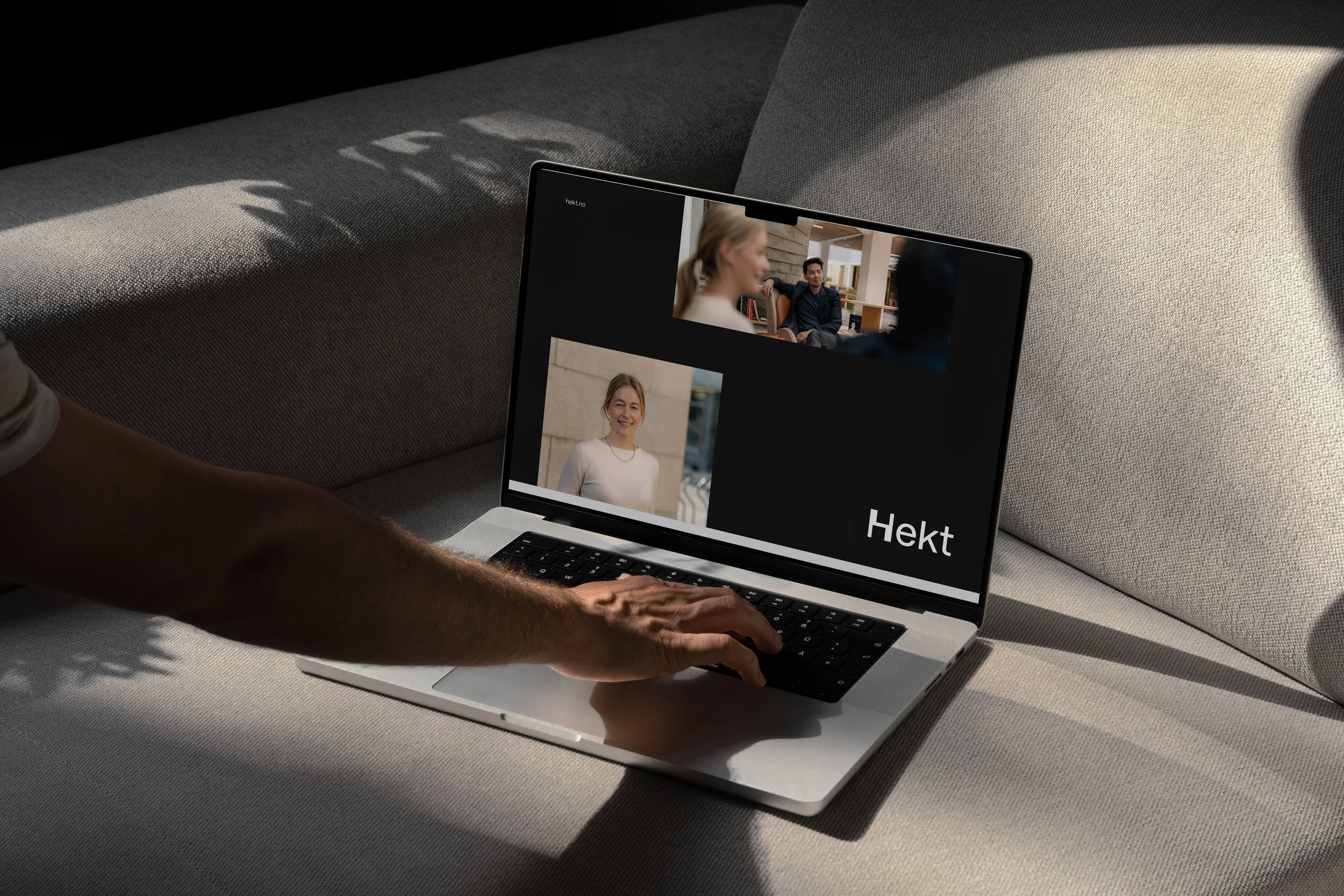
Hekt
Based on a typographical approach, the Hekt identity interprets the brand name in the form of a continuous feed of content, scrolling as a deeply engaged audience would do on their device. The initial letter H becomes literally the framework around Hekt’s body of work, combining a grown-up, solid expression with a highly recognizable visual “twist” that underlines Hekt’s creative potential. The end design plays around with themes of composition variety and diversity.
Role
Designer at Emdash Oslo,
with lead designer Mihail Mihailov
Year
2023
Diciplines
Identity design


